On this page
Settings Page
Exercises tabs, form controls, and layout composition. The bread and butter of SaaS applications.
Settings
Manage your account preferences.
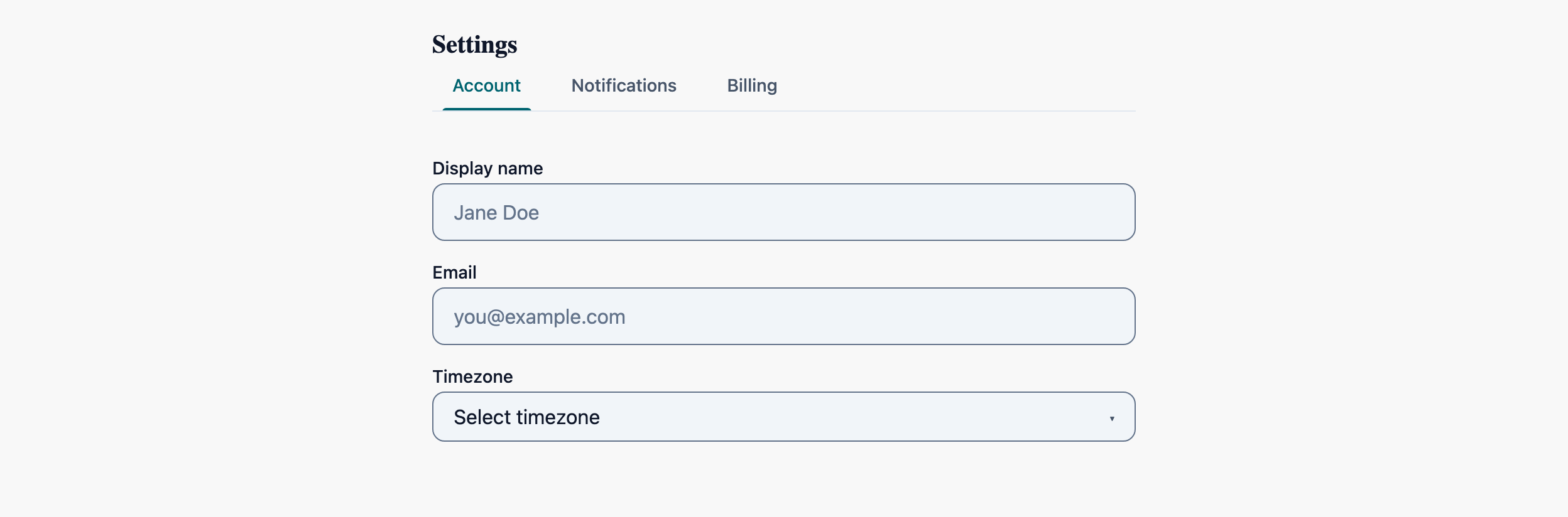
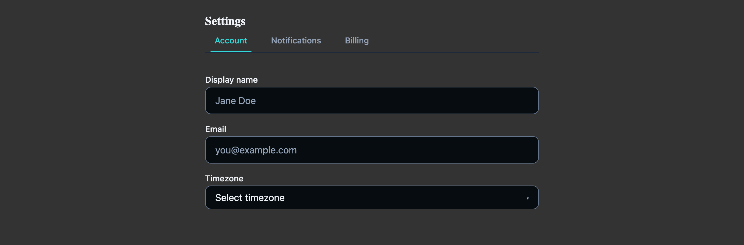
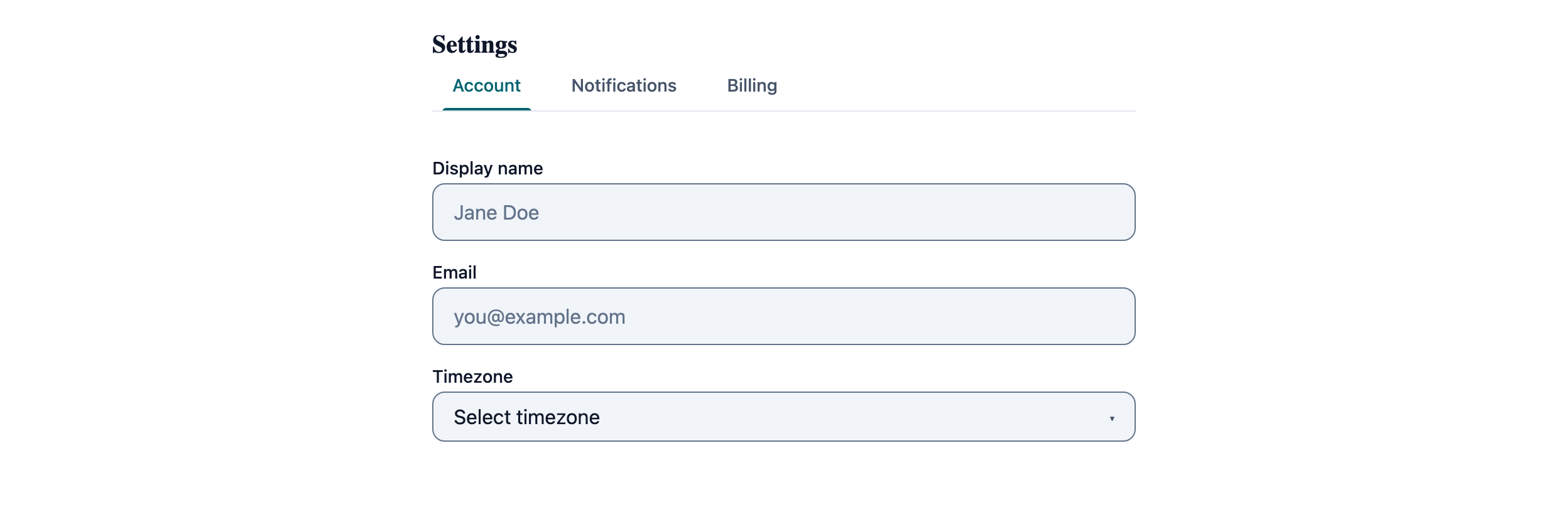
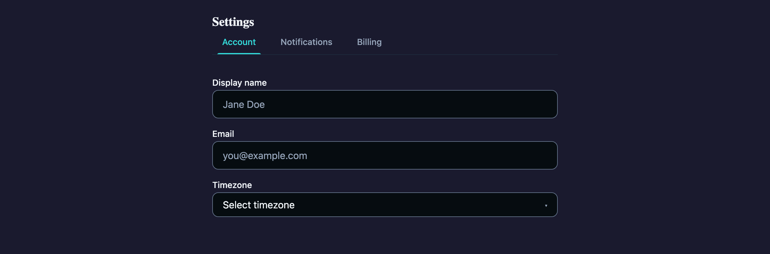
Visual reference
Storybook captures of this pattern in each framework, light and dark modes. The live demo above runs in React; these confirm the Angular and Vue compositions render the same way.


When to use
- A surface where the user toggles roughly 5–25 settings grouped by topic (account, notifications, security, billing).
- Settings change rarely and the user expects a "Save" button rather than autosave.
- You need stable URLs per tab so screenshots and support links survive navigation — wire `selectedIndex` to the route.
When not to use
- Single-screen inline edit of one or two values — use an LlmCard with the input directly, not a tabbed shell.
- Wizard-style sequences where order matters — LlmStepper enforces progression that TabGroup intentionally does not.
- Nested settings that need their own sub-tabs — collapse to an accordion or a list-detail layout instead of nesting tab groups.
Accessibility
- LlmTabGroup uses a roving-tabindex keyboard handler: arrow keys move focus between tabs, Home/End jump to ends, Tab moves into the active panel. Don't override these.
- Each LlmToggle is a `role="switch"` — its label must describe the on-state ("Email notifications") not the action ("Toggle email").
- Autosaving silently is a screen-reader trap. Either keep an explicit Save button (current pattern) or surface autosave with an `aria-live="polite"` region after the fact.
See the accessibility overview for the site-wide WCAG stance and per-component focus / ARIA notes.
Common pitfalls
What an LLM most commonly produces wrong here.
- LLMs frequently hoist tab content into a giant switch in the parent. Each LlmTab's body is the projected child — keep state co-located with the inputs, not the parent.
- Saving a partial form across tab switches breaks the user's mental model. Either persist optimistically per change or block the save button until the user returns to a complete state.
- Don't bind `LlmSelect` to a tuple `{value, label}` — bind the primitive value and let the option element project the label.
Variations
Vertical-tab variant for ≥ 6 sections
TabGroup has no orientation prop — `variant="pills"` only restyles the tabs, it doesn't turn them vertical. You supply the side-tab layout in surrounding CSS (e.g. a flex row with the tablist in a column); the same primitive keeps its keyboard semantics either way.
With unsaved-changes prompt
Wrap the save button in a confirmation flow when `dirty` is true — reuse the Confirmation Dialog pattern verbatim.
Code
Snippets are intentionally trimmed for readability. The full implementation — with state, styles, and demo data — lives in the framework Storybook files linked below.
<llm-tab-group [(selectedIndex)]="activeTab"> <llm-tab label="Account"> <label> Full Name <llm-input placeholder="John Doe" /> </label> <label> Email <llm-input placeholder="john@example.com" /> </label> </llm-tab> <llm-tab label="Notifications"> <llm-toggle [(checked)]="emailOn">Email notifications</llm-toggle> <llm-toggle [(checked)]="pushOn">Push notifications</llm-toggle> </llm-tab></llm-tab-group><llm-button variant="primary" (click)="save()">Save changes</llm-button><LlmTabGroup selectedIndex={tab} onSelectedIndexChange={setTab}> <LlmTab label="Account"> <LlmInput label="Full Name" placeholder="John Doe" /> <LlmInput label="Email" placeholder="john@example.com" /> </LlmTab> <LlmTab label="Notifications"> <LlmToggle checked={emailOn} onCheckedChange={setEmailOn}>Email</LlmToggle> <LlmToggle checked={pushOn} onCheckedChange={setPushOn}>Push</LlmToggle> </LlmTab></LlmTabGroup><LlmButton variant="primary" onClick={save}>Save changes</LlmButton><LlmTabGroup v-model:selectedIndex="activeTab"> <LlmTab label="Account"> <LlmInput v-model:value="name" label="Full Name" /> <LlmInput v-model:value="email" label="Email" /> </LlmTab> <LlmTab label="Notifications"> <LlmToggle v-model:checked="emailOn">Email notifications</LlmToggle> </LlmTab></LlmTabGroup><LlmButton variant="primary" @click="save">Save changes</LlmButton>Open in Storybook
The same composition with state, styles, and demo data — running live in each framework Storybook.