On this page
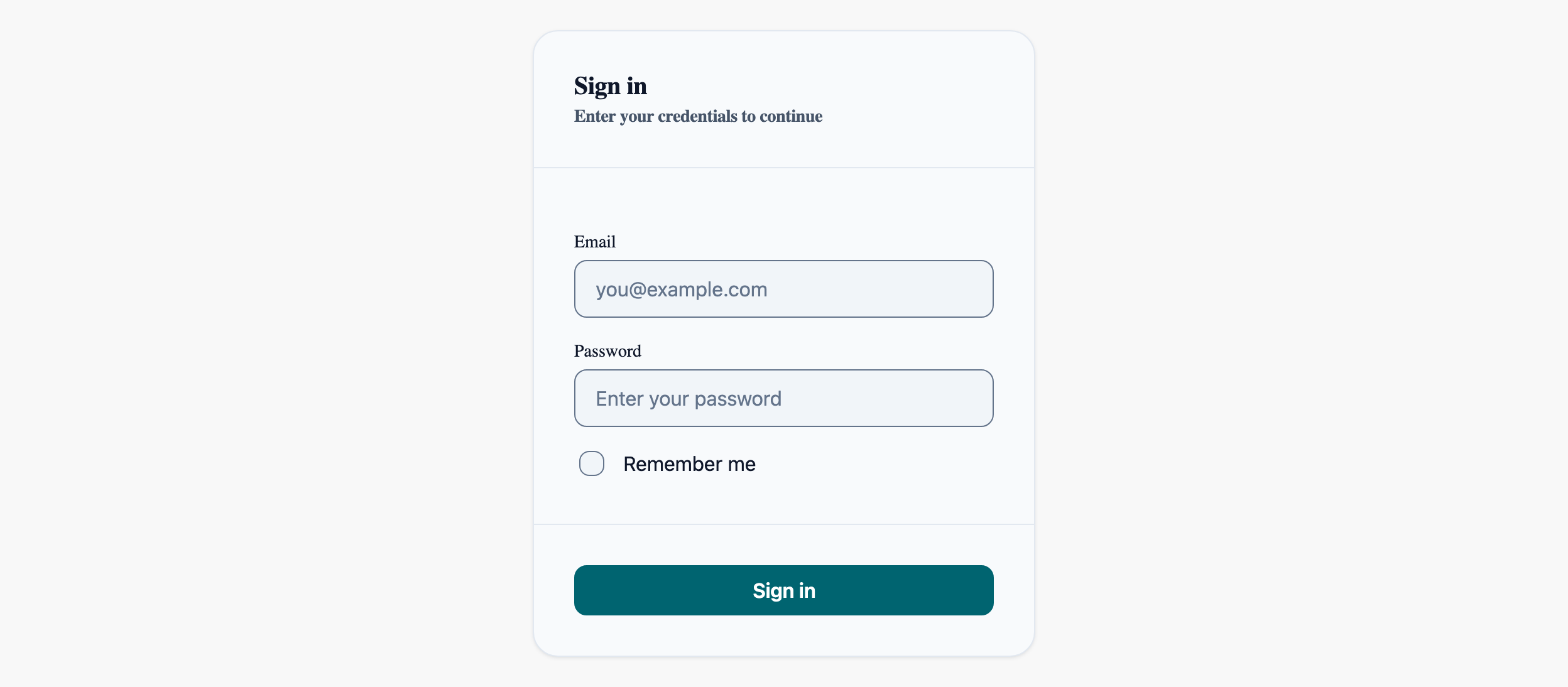
Login Form
The most frequent AI-generated page. Shows Card composition, validation error display, and loading states.
Sign in
Enter your credentials to continue
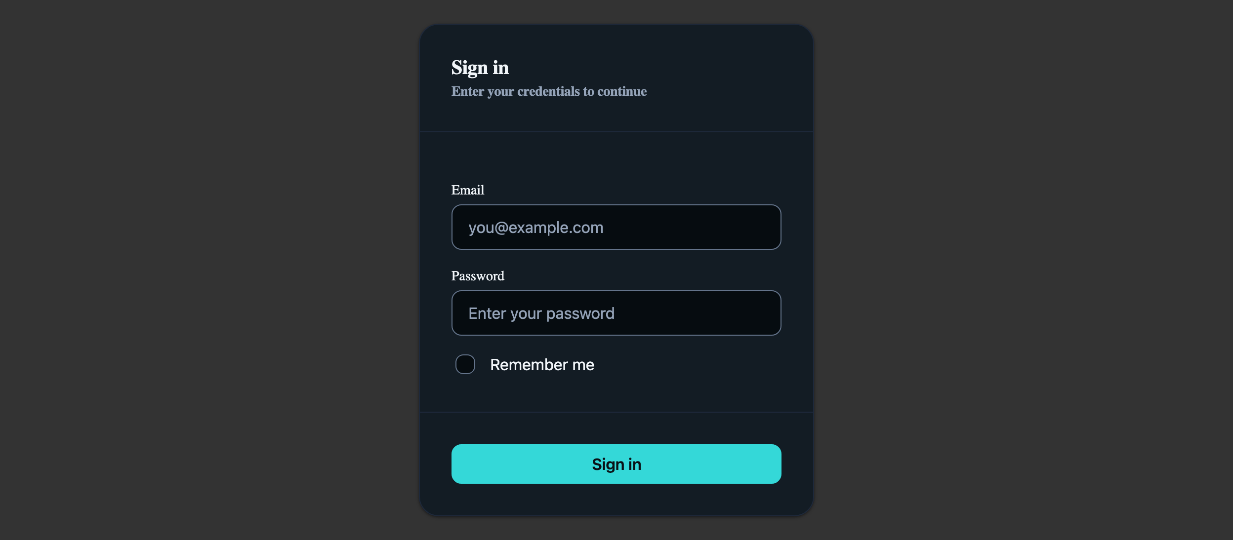
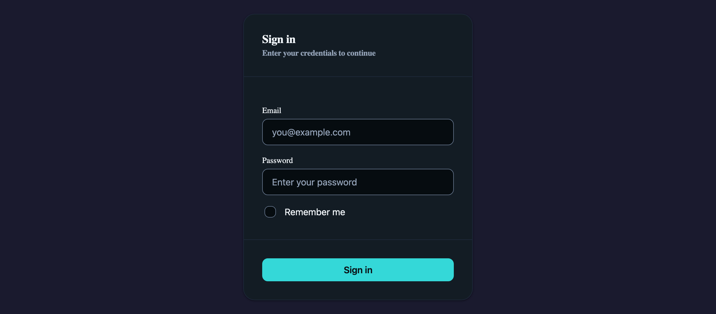
Visual reference
Storybook captures of this pattern in each framework, light and dark modes. The live demo above runs in React; these confirm the Angular and Vue compositions render the same way.


When to use
- Email + password authentication on a public marketing or app surface.
- A short, focused form (≤ 5 fields) where one Card is enough scaffolding.
- You need an inline error region that does not navigate the user away from the form.
When not to use
- Multi-step onboarding flows — reach for LlmStepper instead.
- Passwordless / magic-link flows where the response is a separate state, not a form error.
- When the form needs more than one Card column or section — switch to a Settings-style tabbed layout.
Accessibility
- LlmInput exposes invalid + describedBy linkage automatically when paired with the Alert via aria-describedby — keep the Alert above the inputs so screen readers reach the error first.
- The submit button needs an explicit loading state, not a disabled state with a spinner — disabled buttons are skipped by some assistive tech.
- Label every input. Placeholder is a hint, not a label — never the only descriptor for a field.
See the accessibility overview for the site-wide WCAG stance and per-component focus / ARIA notes.
Common pitfalls
What an LLM most commonly produces wrong here.
- LLMs love to put `aria-required` on every field. Mark required state via the validation schema and the visible label, not as a duplicate ARIA attribute.
- Returning the password value into the input on a failed submit reveals it in the DOM — clear it on error like a native browser would.
- Using `<button type="button">` instead of `type="submit"` breaks Enter-to-submit. Cookbook story uses native submit semantics.
Variations
With "Forgot password?" link
Add an LlmCardFooter row with a secondary link aligned opposite to the submit button — same Card / form structure, no new components.
Social-login alternates
Keep this Card as the email form, then group OAuth buttons in a sibling Card with `variant="outlined"`. Avoid nesting them inside the same form element.
Code
Snippets are intentionally trimmed for readability. The full implementation — with state, styles, and demo data — lives in the framework Storybook files linked below.
<llm-card variant="elevated" padding="lg"> <llm-card-header> <h3>Sign in</h3> </llm-card-header> <llm-card-content> @if (showError()) { <llm-alert variant="danger">Invalid email or password.</llm-alert> } <llm-input type="email" placeholder="you@example.com" [invalid]="showError()" /> <llm-input type="password" placeholder="••••••••" [invalid]="showError()" /> <llm-checkbox>Remember me</llm-checkbox> </llm-card-content> <llm-card-footer> <llm-button variant="primary" [loading]="loading()" (click)="signIn()"> Sign in </llm-button> </llm-card-footer></llm-card><LlmCard variant="elevated" padding="lg"> <LlmCardHeader><h3>Sign in</h3></LlmCardHeader> <LlmCardContent> {showError && <LlmAlert variant="danger">Invalid email or password.</LlmAlert>} <LlmInput type="email" placeholder="you@example.com" invalid={showError} /> <LlmInput type="password" placeholder="••••••••" invalid={showError} /> <LlmCheckbox>Remember me</LlmCheckbox> </LlmCardContent> <LlmCardFooter> <LlmButton variant="primary" loading={loading} onClick={signIn}> Sign in </LlmButton> </LlmCardFooter></LlmCard><LlmCard variant="elevated" padding="lg"> <LlmCardHeader>Sign in</LlmCardHeader> <LlmCardContent> <LlmAlert v-if="showError" variant="danger">Invalid email or password.</LlmAlert> <LlmInput type="email" placeholder="you@example.com" v-model:value="email" /> <LlmInput type="password" placeholder="••••••••" v-model:value="password" /> <LlmCheckbox v-model:checked="remember">Remember me</LlmCheckbox> </LlmCardContent> <LlmCardFooter> <LlmButton variant="primary" :loading="loading" @click="signIn">Sign in</LlmButton> </LlmCardFooter></LlmCard>Open in Storybook
The same composition with state, styles, and demo data — running live in each framework Storybook.