On this page
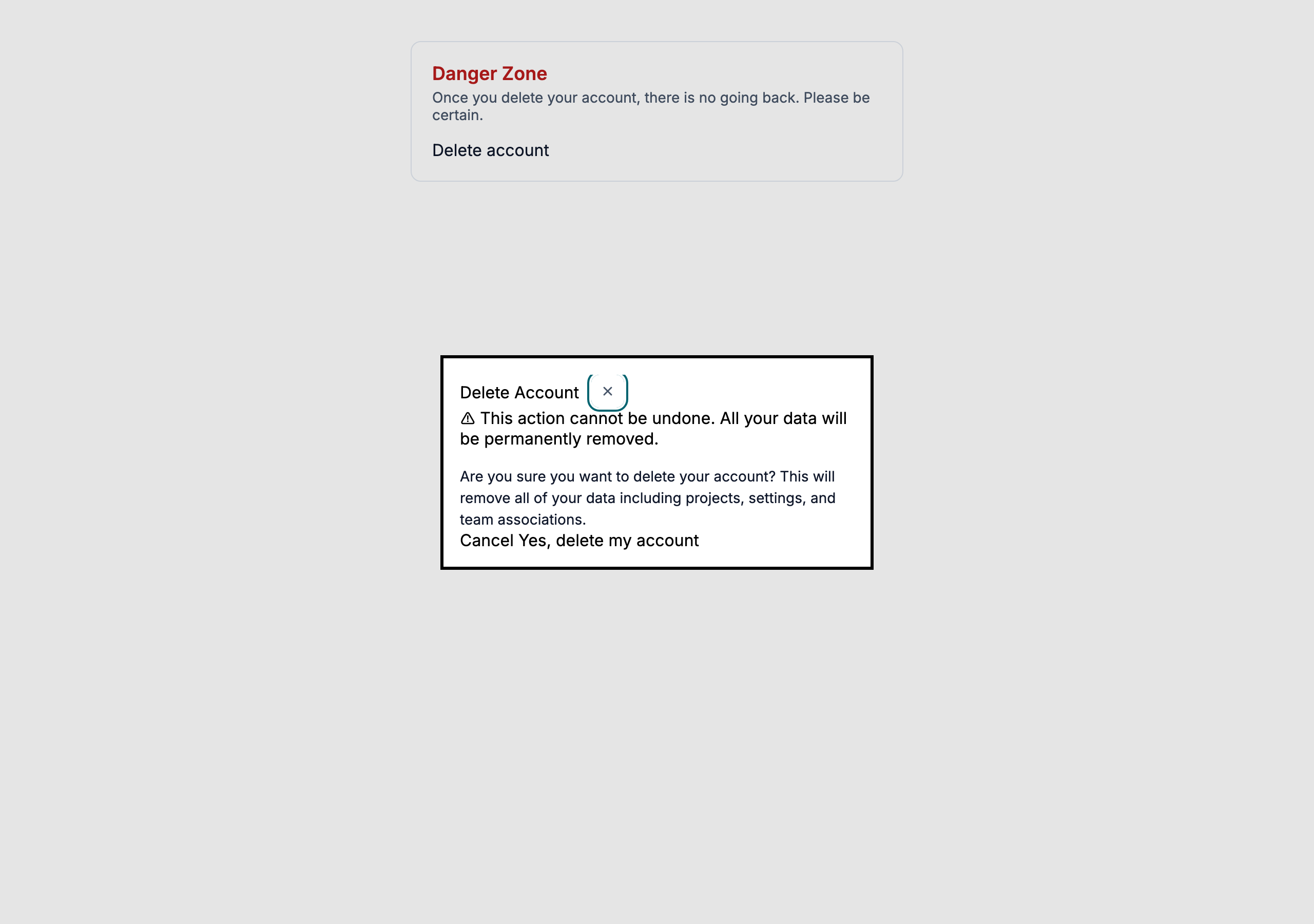
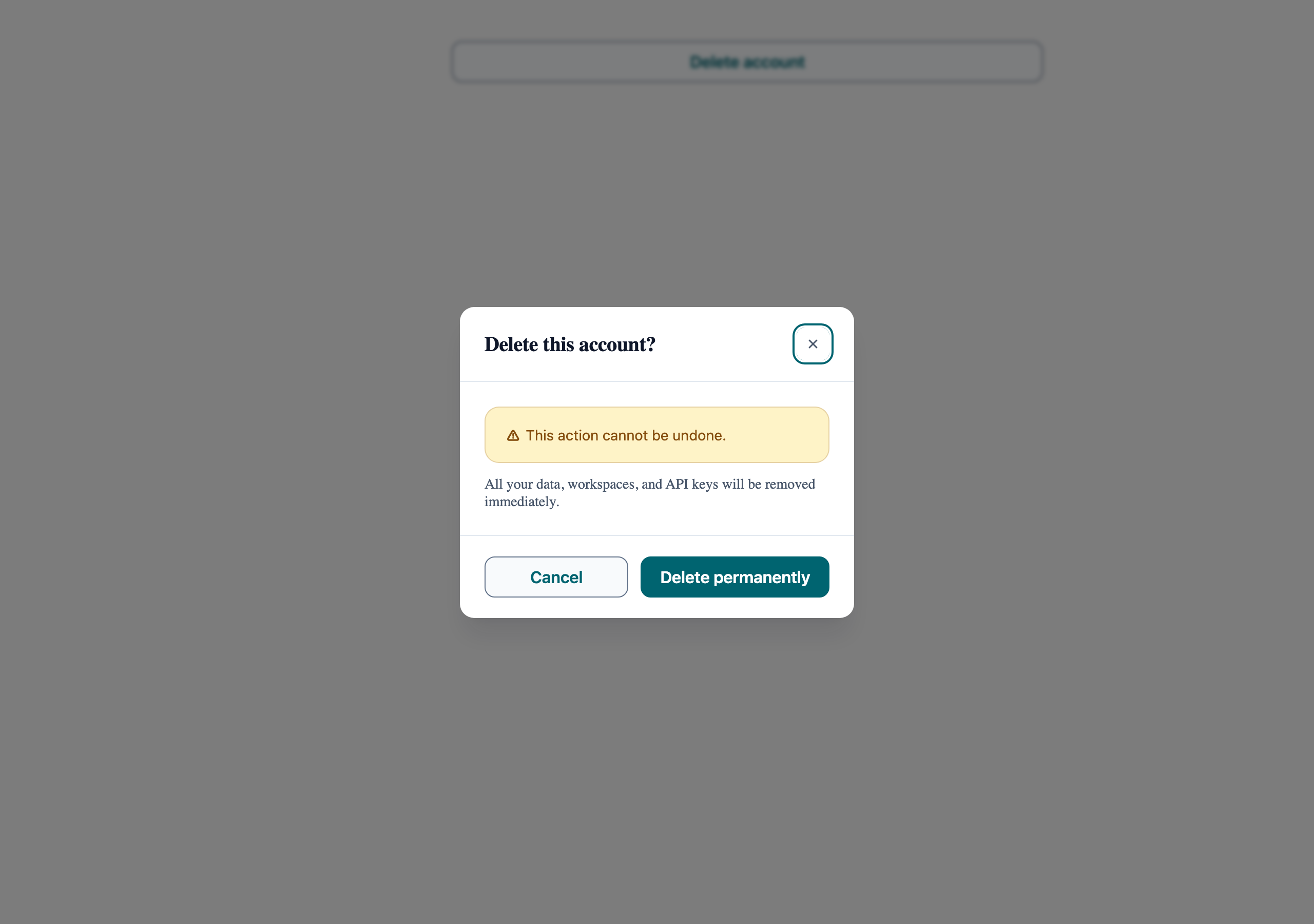
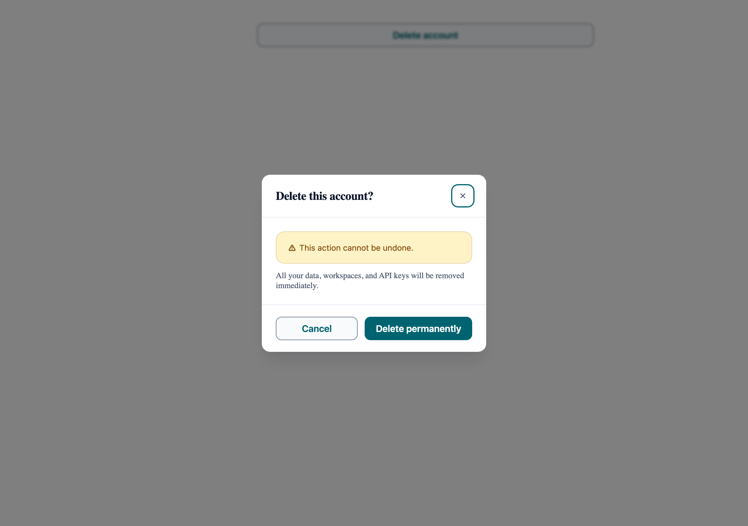
Confirmation Dialog
Accessible modal flow for destructive actions. Shows trigger → dialog → action logic.
Danger Zone
Deleting your account is permanent.
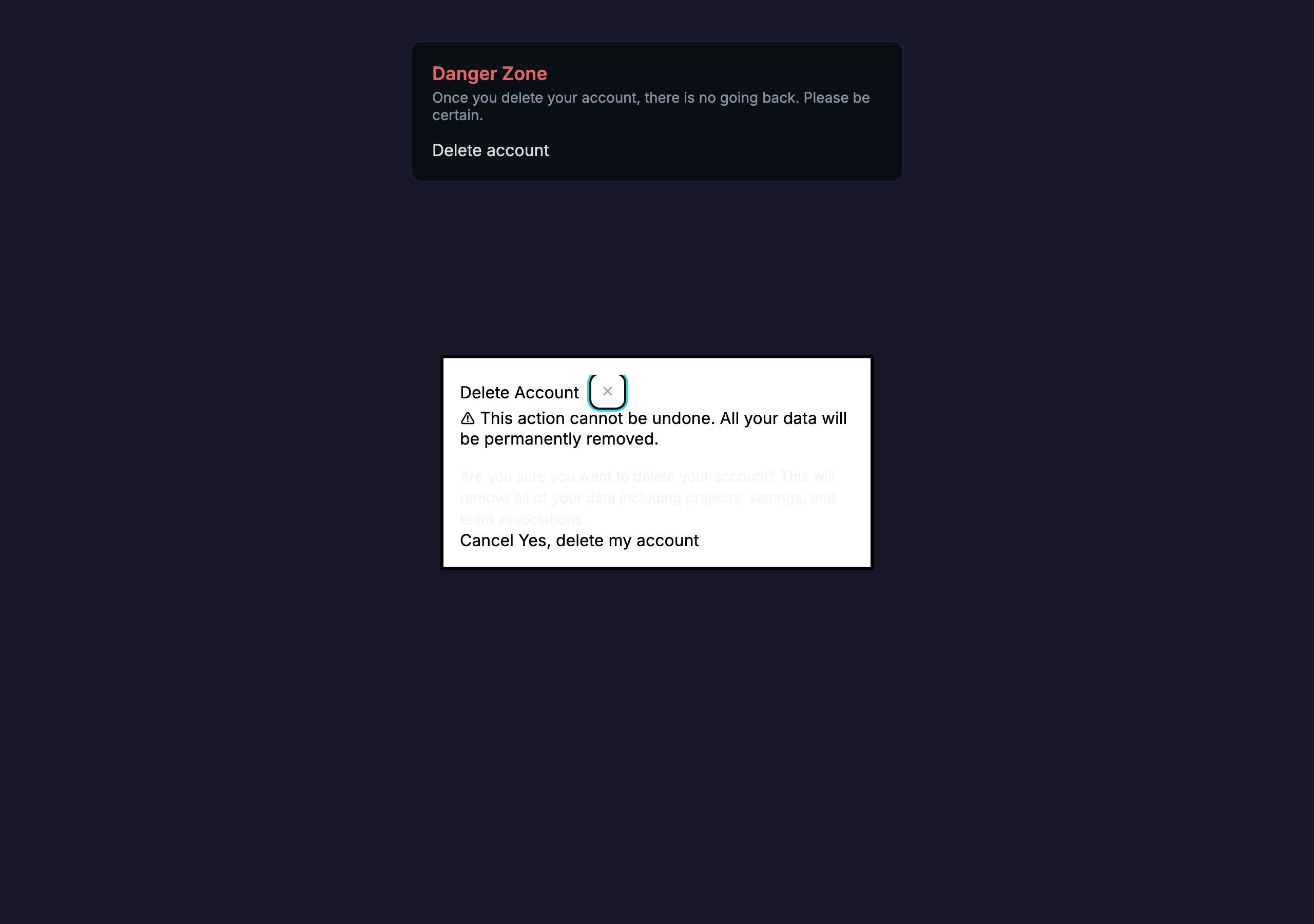
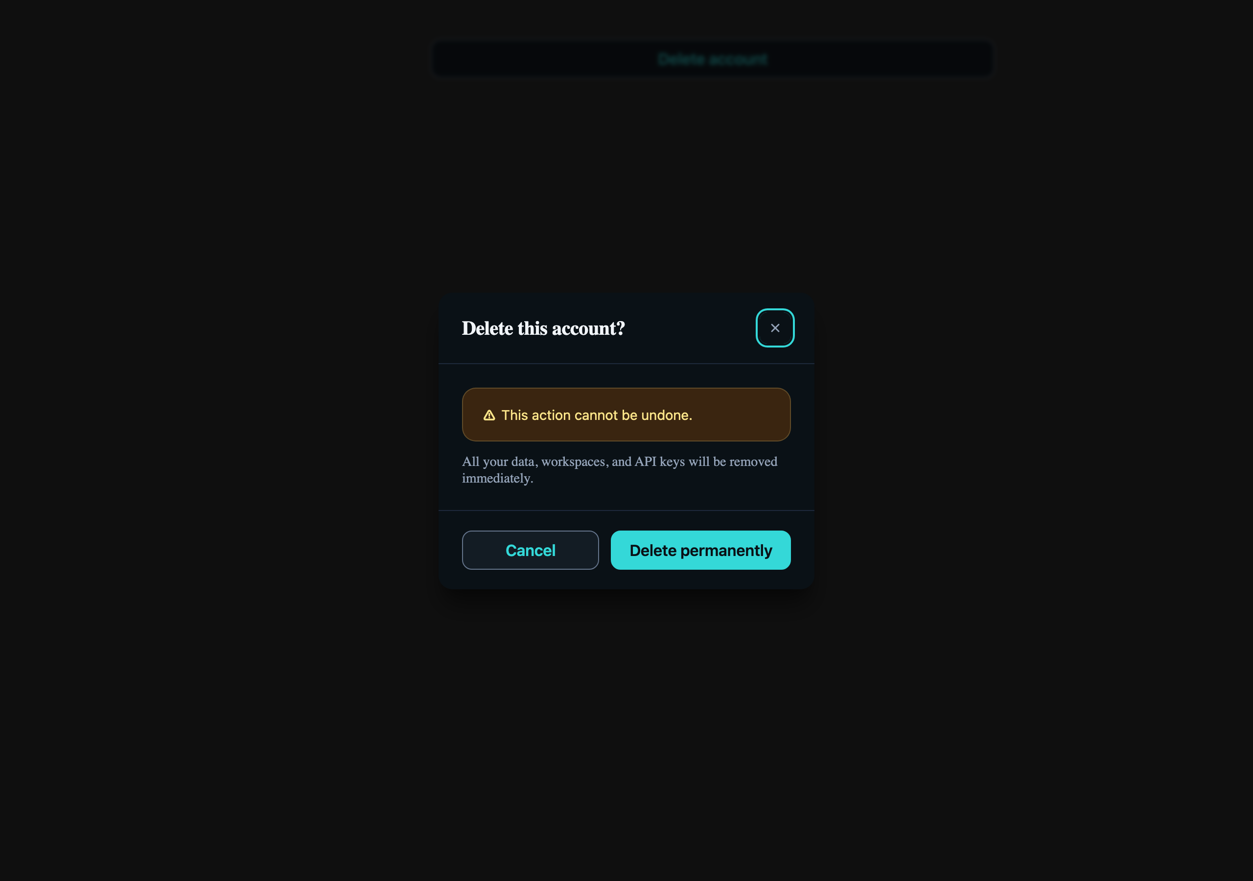
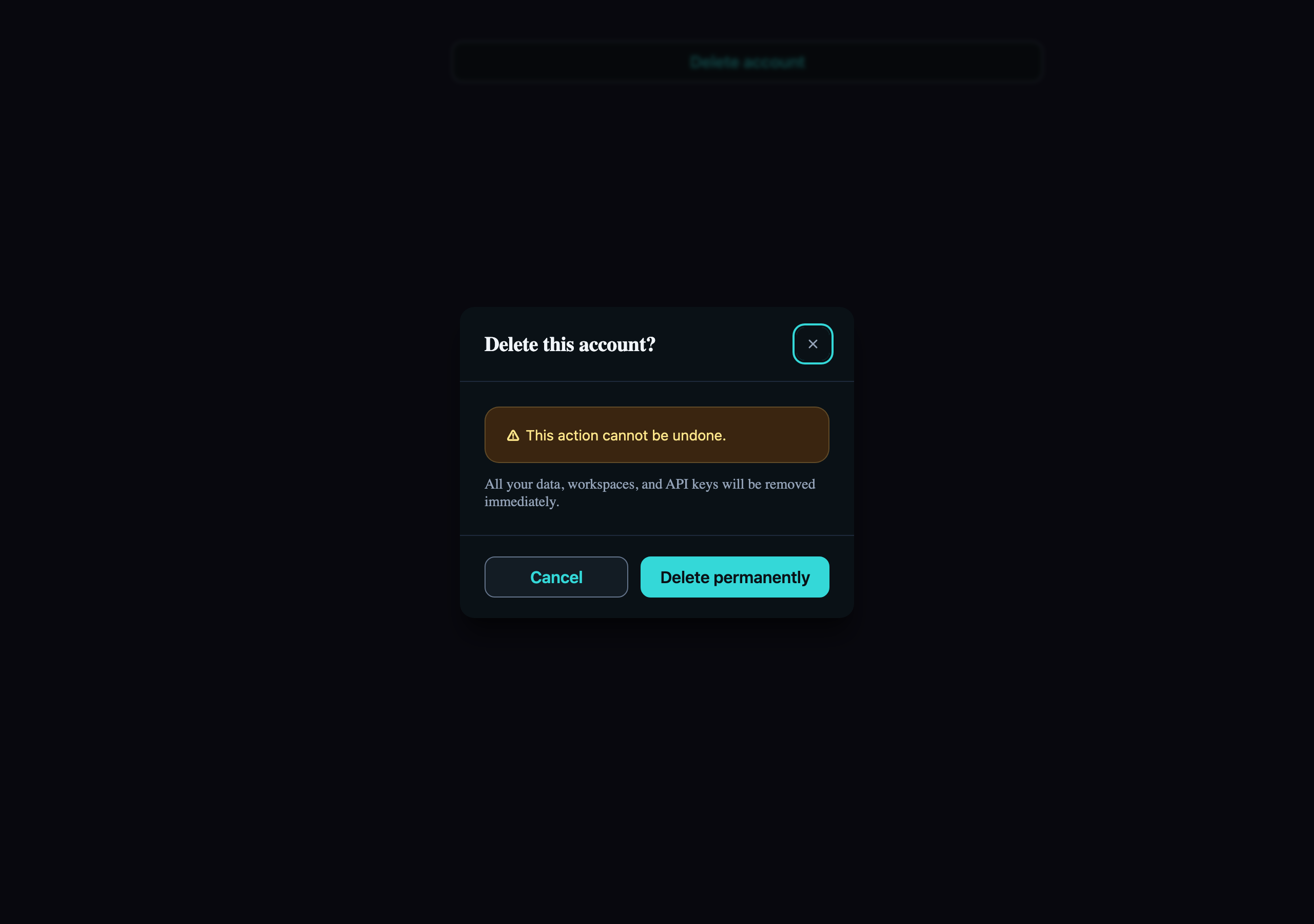
Visual reference
Storybook captures of this pattern in each framework, light and dark modes. The live demo above runs in React; these confirm the Angular and Vue compositions render the same way.
When to use
- Irreversible actions: deleting an account, revoking an API key, leaving an organization.
- Actions whose blast radius the user might underestimate ("delete project" hides "delete all 4,000 issues").
- When the operation is fast enough that a modal is acceptable — anything > ~3 s should open a separate destination, not a dialog.
When not to use
- Reversible actions with an undo affordance — show an LlmToast with an "Undo" action instead.
- Form-style multi-field confirmation ("type the project name to confirm") — that's a destructive form, render it on its own page or in an LlmDrawer.
- As an "are you sure?" wrapper around every save button. Confirmation fatigue trains users to click through.
Accessibility
- LlmDialog uses the native `<dialog>` element with `cdkTrapFocus` — focus moves to the first focusable inside, restores on close. Don't reimplement.
- Escape-to-close comes from the native `<dialog>` element's cancel event — the component intercepts it and routes it through the `open` binding as a close request. If an in-flight operation must not be interrupted, ignore that request (keep `open` true) until the mutation settles.
- The destructive button must remain the *secondary* visual call to action — Cancel as `outline`, "Yes, delete" as `primary`. Reversing colour just to make red prominent is a contrast trap.
See the accessibility overview for the site-wide WCAG stance and per-component focus / ARIA notes.
Common pitfalls
What an LLM most commonly produces wrong here.
- LLMs frequently add `autoFocus` to the destructive button — this nudges users into an accidental confirm. The first Tab stop should be Cancel.
- Forgetting to gate the trigger when the action is already in flight produces double-deletes; flip the dialog's `open` to false only after the mutation resolves.
- Putting body content as a raw string inside `LlmDialogContent` skips the LlmAlert composition the cookbook recommends — the Alert is what carries the warning role for assistive tech.
Variations
With type-to-confirm input
Add an LlmInput inside `LlmDialogContent` that the user must type the resource name into. Disable the destructive button until match.
Loading state
Bind `loading={pending}` on the destructive LlmButton; keep the dialog open so a slow network failure doesn't lose context.
Code
Snippets are intentionally trimmed for readability. The full implementation — with state, styles, and demo data — lives in the framework Storybook files linked below.
<llm-button variant="primary" (click)="isOpen.set(true)">Delete account</llm-button>
<llm-dialog [(open)]="isOpen" size="sm"> <llm-dialog-header>Delete Account</llm-dialog-header> <llm-dialog-content> <llm-alert variant="warning">This action cannot be undone.</llm-alert> </llm-dialog-content> <llm-dialog-footer> <llm-button variant="outline" (click)="isOpen.set(false)">Cancel</llm-button> <llm-button variant="primary" (click)="confirm()">Yes, delete</llm-button> </llm-dialog-footer></llm-dialog><LlmButton onClick={() => setOpen(true)}>Delete account</LlmButton>
<LlmDialog open={open} onOpenChange={setOpen} size="sm"> <LlmDialogHeader>Delete Account</LlmDialogHeader> <LlmDialogContent> <LlmAlert variant="warning">This action cannot be undone.</LlmAlert> </LlmDialogContent> <LlmDialogFooter> <LlmButton variant="outline" onClick={() => setOpen(false)}>Cancel</LlmButton> <LlmButton variant="primary" onClick={confirm}>Yes, delete</LlmButton> </LlmDialogFooter></LlmDialog><LlmButton variant="primary" @click="isOpen = true">Delete account</LlmButton>
<LlmDialog v-model:open="isOpen" size="sm"> <LlmDialogHeader>Delete Account</LlmDialogHeader> <LlmDialogContent> <LlmAlert variant="warning">This action cannot be undone.</LlmAlert> </LlmDialogContent> <LlmDialogFooter> <LlmButton variant="outline" @click="isOpen = false">Cancel</LlmButton> <LlmButton variant="primary" @click="confirm">Yes, delete</LlmButton> </LlmDialogFooter></LlmDialog>Open in Storybook
The same composition with state, styles, and demo data — running live in each framework Storybook.