On this page
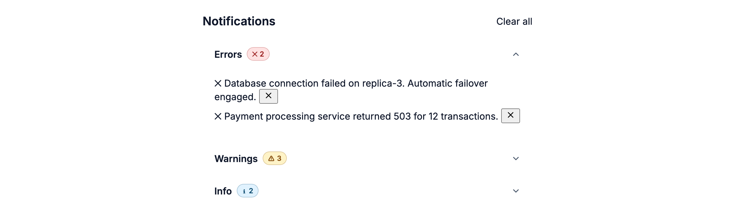
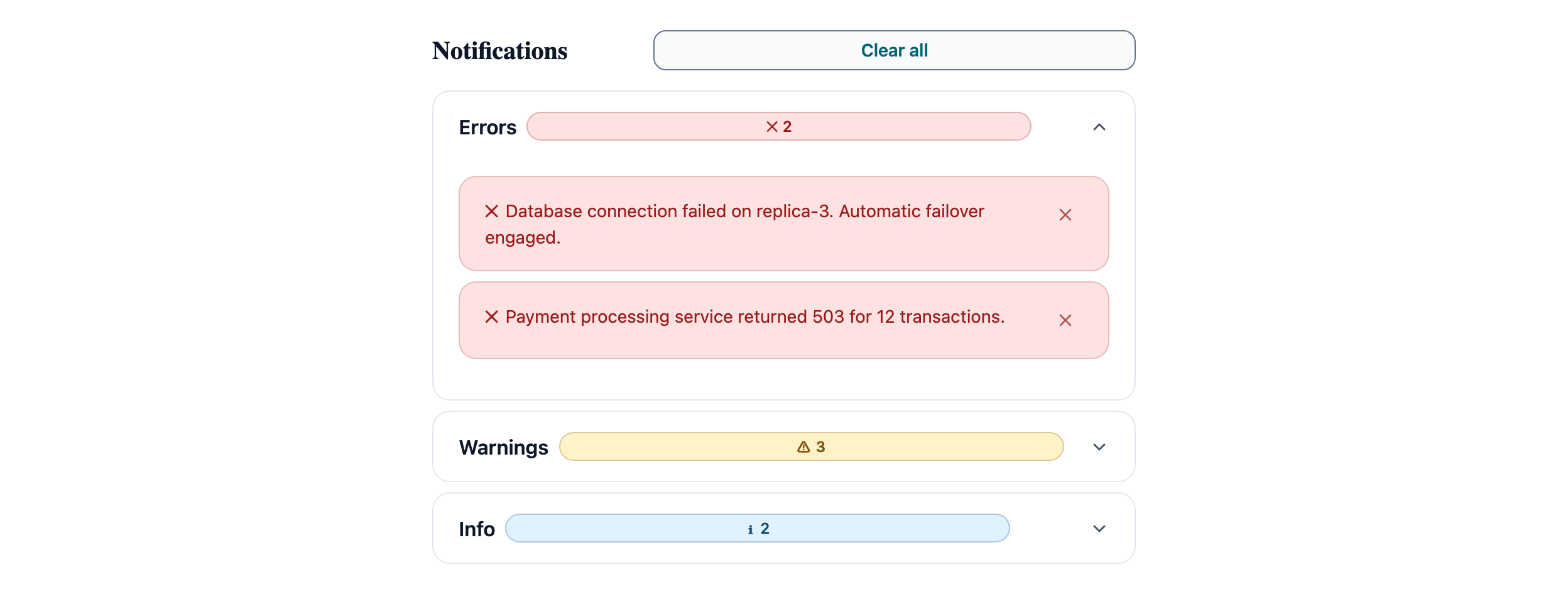
Notification Center
Structural feedback grouping using Accordion and Alert. Useful for monitoring and admin tools.
Notifications
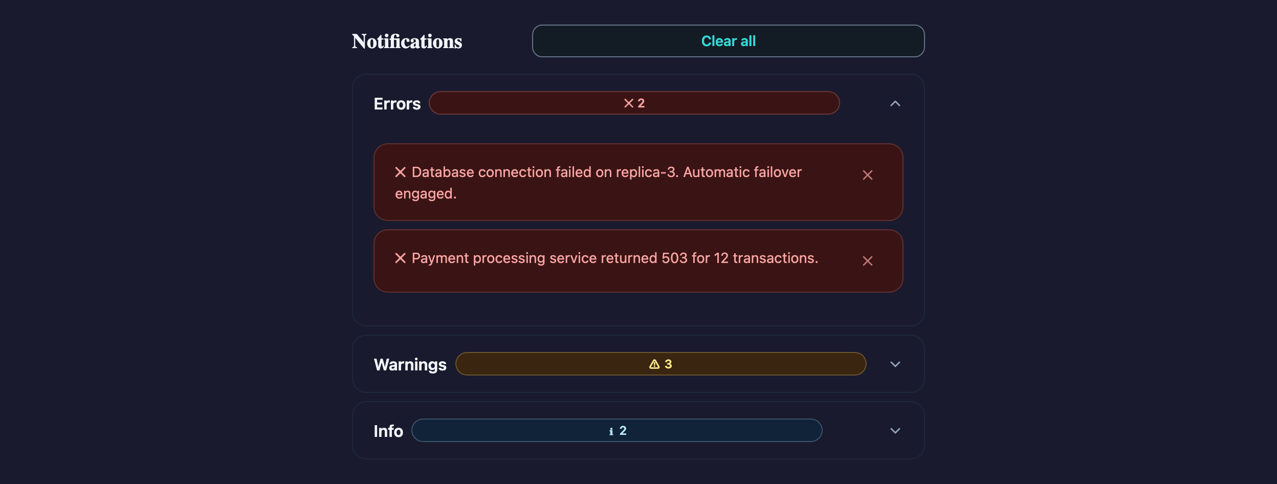
Visual reference
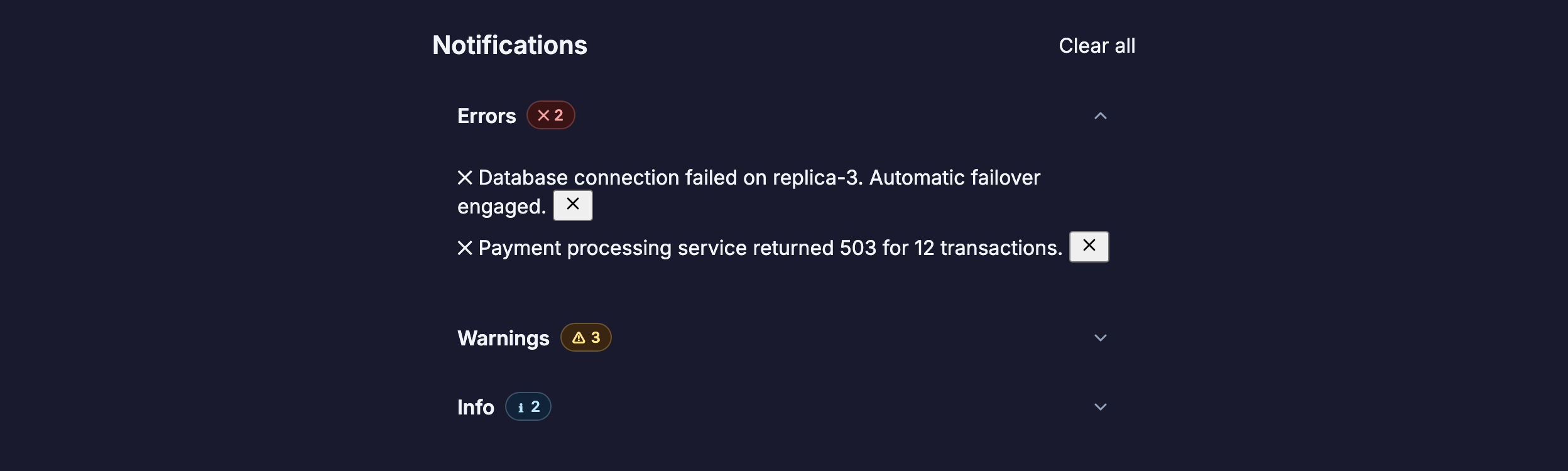
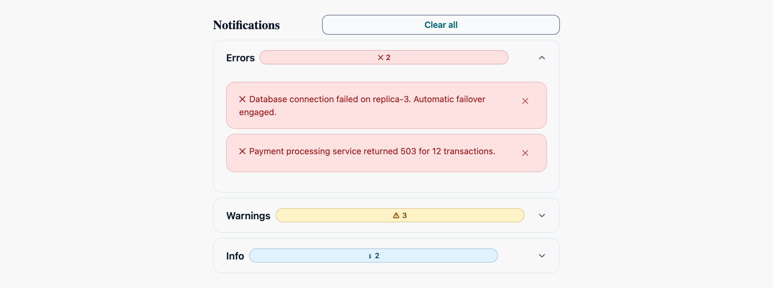
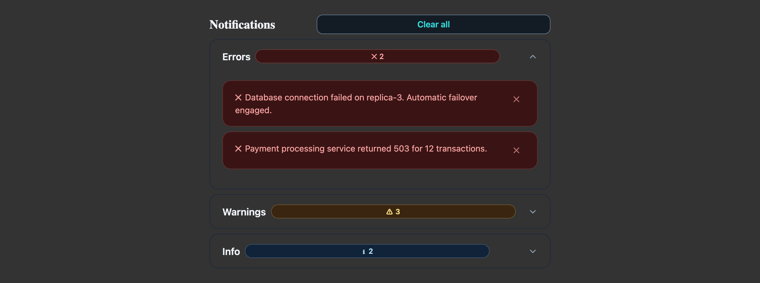
Storybook captures of this pattern in each framework, light and dark modes. The live demo above runs in React; these confirm the Angular and Vue compositions render the same way.
When to use
- A surface where users review historical notifications grouped by severity (errors, warnings, info).
- Notifications can be dismissed independently and the user wants to see related items together.
- You expect 10–200 items — fewer than 10 should render flat without the accordion wrapper.
When not to use
- Transient toast-style notifications — use LlmToast with `aria-live="assertive"` (error) or `polite` (info), not an accordion.
- A single critical message — inline LlmAlert above the page is louder and harder to ignore than a collapsed accordion section.
- Real-time logs / streaming output — the accordion expansion animation fights the auto-scroll. Use a virtual-scrolled list instead.
Accessibility
- LlmAccordionGroup with `multi={true}` lets users keep severity sections open simultaneously — match the user's mental model of triage.
- Each LlmAlert's `role` is bound to its variant (`alert` for danger/warning, `status` for info/success). Don't override.
- The badge counts beside each accordion header must update when items are dismissed — assistive tech reads the header text on focus, not the changing count below.
See the accessibility overview for the site-wide WCAG stance and per-component focus / ARIA notes.
Common pitfalls
What an LLM most commonly produces wrong here.
- LLMs frequently nest LlmAccordionGroup inside another accordion — flat groupings work better; switch to LlmTabs if you really need two axes.
- Auto-collapsing the section when its last item is dismissed is jarring on keyboard users mid-action — leave it open and show an empty-state row.
- Marking everything as `variant="danger"` so the user "really sees it" trains them to ignore the colour. Reserve danger for actual failures.
Variations
With "Mark all read" + filter chips
Add a LlmTabGroup above the accordion with severity filters; drive the visible groups from selected filter state.
Inline-only (no accordion)
For ≤ 5 items, drop the AccordionGroup and render Alerts directly; preserves the same dismiss handlers.
Code
Snippets are intentionally trimmed for readability. The full implementation — with state, styles, and demo data — lives in the framework Storybook files linked below.
<llm-accordion-group [multi]="true" variant="separated"> <llm-accordion-item [expanded]="true"> <span llmAccordionHeader> Errors <llm-badge variant="danger" size="sm">2</llm-badge> </span> <llm-alert variant="danger">Database failed.</llm-alert> <llm-alert variant="danger">Service 503.</llm-alert> </llm-accordion-item> <llm-accordion-item> <span llmAccordionHeader> Warnings <llm-badge variant="warning" size="sm">1</llm-badge> </span> <llm-alert variant="warning">Disk at 89%.</llm-alert> </llm-accordion-item></llm-accordion-group><LlmAccordionGroup multi variant="separated"> <LlmAccordionItem expanded> <span>Errors <LlmBadge variant="danger" size="sm">2</LlmBadge></span> <LlmAlert variant="danger">Database failed.</LlmAlert> <LlmAlert variant="danger">Service 503.</LlmAlert> </LlmAccordionItem> <LlmAccordionItem> <span>Warnings <LlmBadge variant="warning" size="sm">1</LlmBadge></span> <LlmAlert variant="warning">Disk at 89%.</LlmAlert> </LlmAccordionItem></LlmAccordionGroup><LlmAccordionGroup :multi="true" variant="separated"> <LlmAccordionItem :expanded="true"> <template #header> Errors <LlmBadge variant="danger">2</LlmBadge> </template> <LlmAlert variant="danger">Database failed.</LlmAlert> </LlmAccordionItem> <LlmAccordionItem> <template #header> Warnings <LlmBadge variant="warning">1</LlmBadge> </template> <LlmAlert variant="warning">Disk at 89%.</LlmAlert> </LlmAccordionItem></LlmAccordionGroup>Open in Storybook
The same composition with state, styles, and demo data — running live in each framework Storybook.