On this page
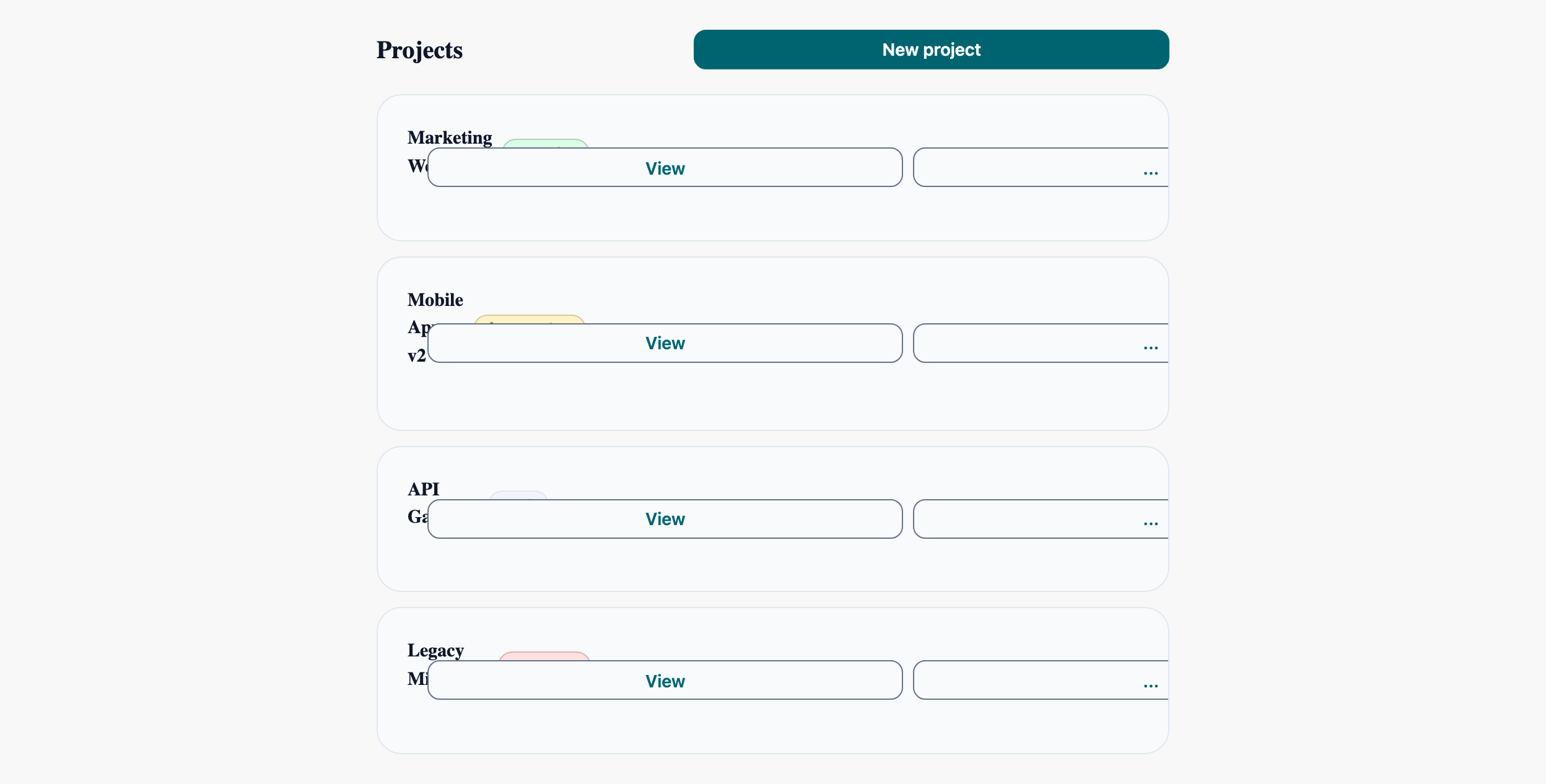
Data List with Actions
Inline actions on a list of items. The core pattern for dashboards and admin panels — Card + Badge + Button composition.
Projects
Brand-refresh landing page
Cross-platform rewrite in Flutter
Microservices ingress layer
PHP monolith → Node services
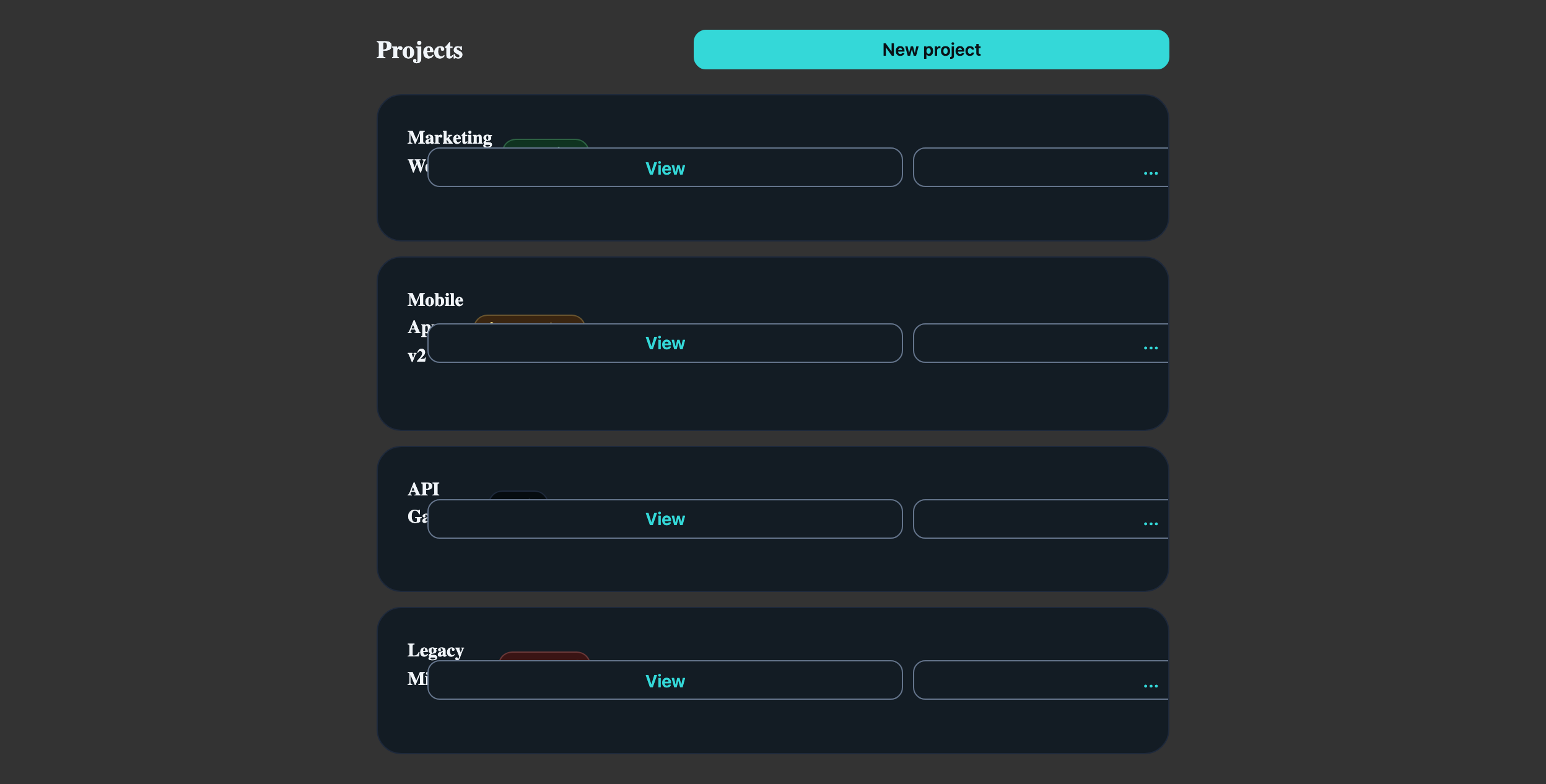
Visual reference
Storybook captures of this pattern in each framework, light and dark modes. The live demo above runs in React; these confirm the Angular and Vue compositions render the same way.


When to use
- Lists of 5–50 items where each item has 1 primary action and 2–4 secondary actions.
- Items have a status indicator that benefits from a Badge's colour semantics (Active, Pending, Failed).
- You want each row independently focusable so keyboard users can act on it without tab-trapping in a Table.
When not to use
- More than ~50 items — switch to LlmTable with sorting, sticky header, and pagination.
- Items whose primary affordance is reading, not acting — use a plain styled list without per-row buttons.
- Lists that need column alignment across rows — Cards collapse content; Tables align it.
Accessibility
- LlmMenuTrigger from CDK Menu manages roving focus inside the popped menu — don't hand-roll arrow-key handlers, you'll fight the focus manager.
- Each "..." button needs an `aria-label` ("More actions for Marketing Website"). Tooltips improve hover but don't replace the accessible name.
- When status changes async, surface the Badge update via an `aria-live="polite"` region on the list, not a per-row live region — fewer announcements.
See the accessibility overview for the site-wide WCAG stance and per-component focus / ARIA notes.
Common pitfalls
What an LLM most commonly produces wrong here.
- LLMs render `<a>` and `<button>` interchangeably for row actions — use `<button>` for "Edit", `<a>` only for navigation. Mixing breaks Cmd-click behaviour.
- Putting the entire row inside a `<button>` swallows the inner buttons' click handlers. Use a clickable region pattern (cursor + keydown) rather than a wrapping button.
- The cookbook story uses LlmMenu for Edit / Duplicate / Delete because each is a separate operation. If you only have one secondary action, drop the menu and inline the button.
Variations
With selection checkboxes
Add an LlmCheckbox at the row start; lift selection state to the parent and surface a bulk-action bar above the list.
With drag-handle reorder
Add a drag handle button — wrap rows in `@angular/cdk/drag-drop` (Angular) / `dnd-kit` (React) / `vuedraggable` (Vue). The cookbook stays component-only.
Code
Snippets are intentionally trimmed for readability. The full implementation — with state, styles, and demo data — lives in the framework Storybook files linked below.
<div class="list-header"> <h2>Projects</h2> <llm-button variant="primary" size="sm">New project</llm-button></div>@for (item of items(); track item.id) { <llm-card variant="outlined" padding="md"> <llm-card-content> <span>{{ item.name }}</span> <llm-badge [variant]="item.statusVariant" size="sm">{{ item.status }}</llm-badge> <p>{{ item.description }}</p> <llm-button variant="outline" size="sm" llmTooltip="View details">View</llm-button> <llm-button variant="outline" size="sm" [llmMenuTriggerFor]="actionsMenu" llmTooltip="More actions" >...</llm-button> <ng-template #actionsMenu> <llm-menu> <llm-menu-item>Edit</llm-menu-item> <llm-menu-item>Duplicate</llm-menu-item> <llm-menu-separator /> <llm-menu-item>Delete</llm-menu-item> </llm-menu> </ng-template> </llm-card-content> </llm-card>}<div className="list-header"> <h2>Projects</h2> <LlmButton variant="primary" size="sm">New project</LlmButton></div>{items.map(item => ( <LlmCard key={item.id} variant="outlined" padding="md"> <LlmCardContent> <span>{item.name}</span> <LlmBadge variant={item.statusVariant} size="sm">{item.status}</LlmBadge> <p>{item.description}</p> <LlmTooltip llmTooltip="View details"> <LlmButton variant="outline" size="sm">View</LlmButton> </LlmTooltip> <LlmMenuTrigger menu={ <LlmMenu variant="compact"> <LlmMenuItem>Edit</LlmMenuItem> <LlmMenuItem>Duplicate</LlmMenuItem> <LlmMenuSeparator /> <LlmMenuItem>Delete</LlmMenuItem> </LlmMenu> } > {({ onClick, ref }) => ( <LlmTooltip llmTooltip="More actions"> <LlmButton ref={ref} onClick={onClick} variant="outline" size="sm">...</LlmButton> </LlmTooltip> )} </LlmMenuTrigger> </LlmCardContent> </LlmCard>))}<div class="list-header"> <h2>Projects</h2> <LlmButton variant="primary" size="sm">New project</LlmButton></div><LlmCard v-for="item in items" :key="item.id" variant="outlined" padding="md"> <LlmCardContent> <span>{{ item.name }}</span> <LlmBadge :variant="item.statusVariant" size="sm">{{ item.status }}</LlmBadge> <p>{{ item.description }}</p> <LlmTooltip llmTooltip="View details"> <LlmButton variant="outline" size="sm">View</LlmButton> </LlmTooltip> <LlmMenuTrigger> <template #trigger> <LlmTooltip llmTooltip="More actions"> <LlmButton variant="outline" size="sm">...</LlmButton> </LlmTooltip> </template> <template #menu> <LlmMenu variant="compact"> <LlmMenuItem>Edit</LlmMenuItem> <LlmMenuItem>Duplicate</LlmMenuItem> <LlmMenuSeparator /> <LlmMenuItem>Delete</LlmMenuItem> </LlmMenu> </template> </LlmMenuTrigger> </LlmCardContent></LlmCard>Open in Storybook
The same composition with state, styles, and demo data — running live in each framework Storybook.