On this page
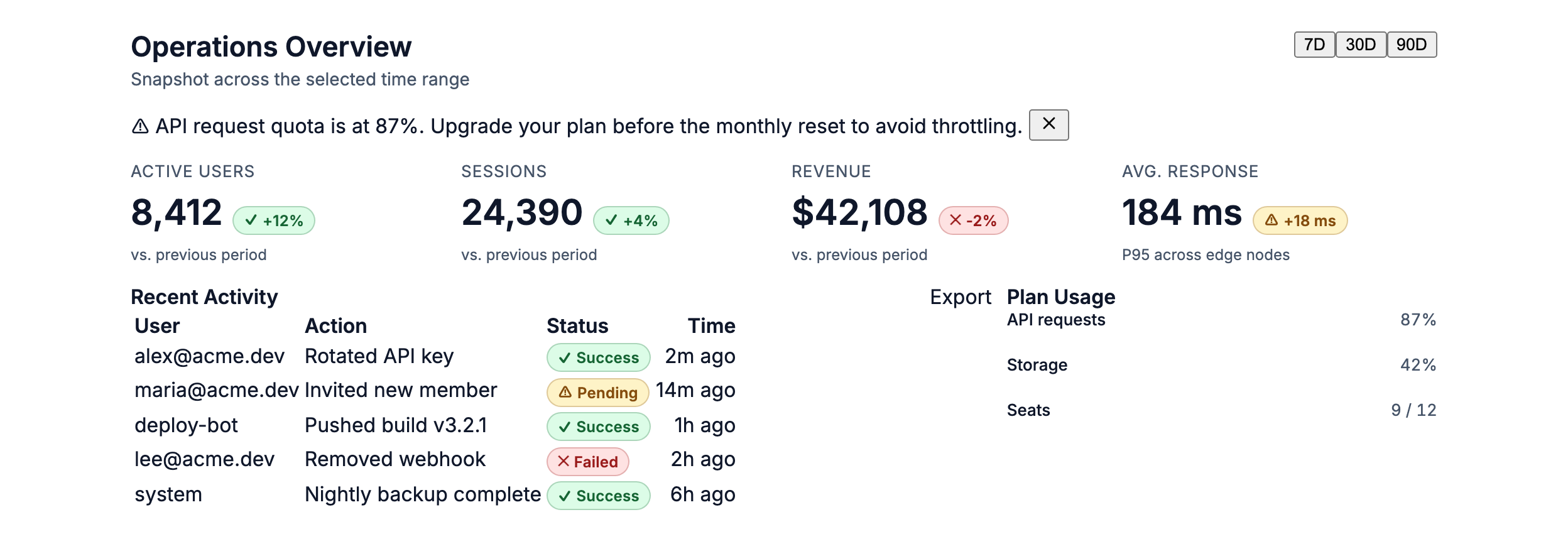
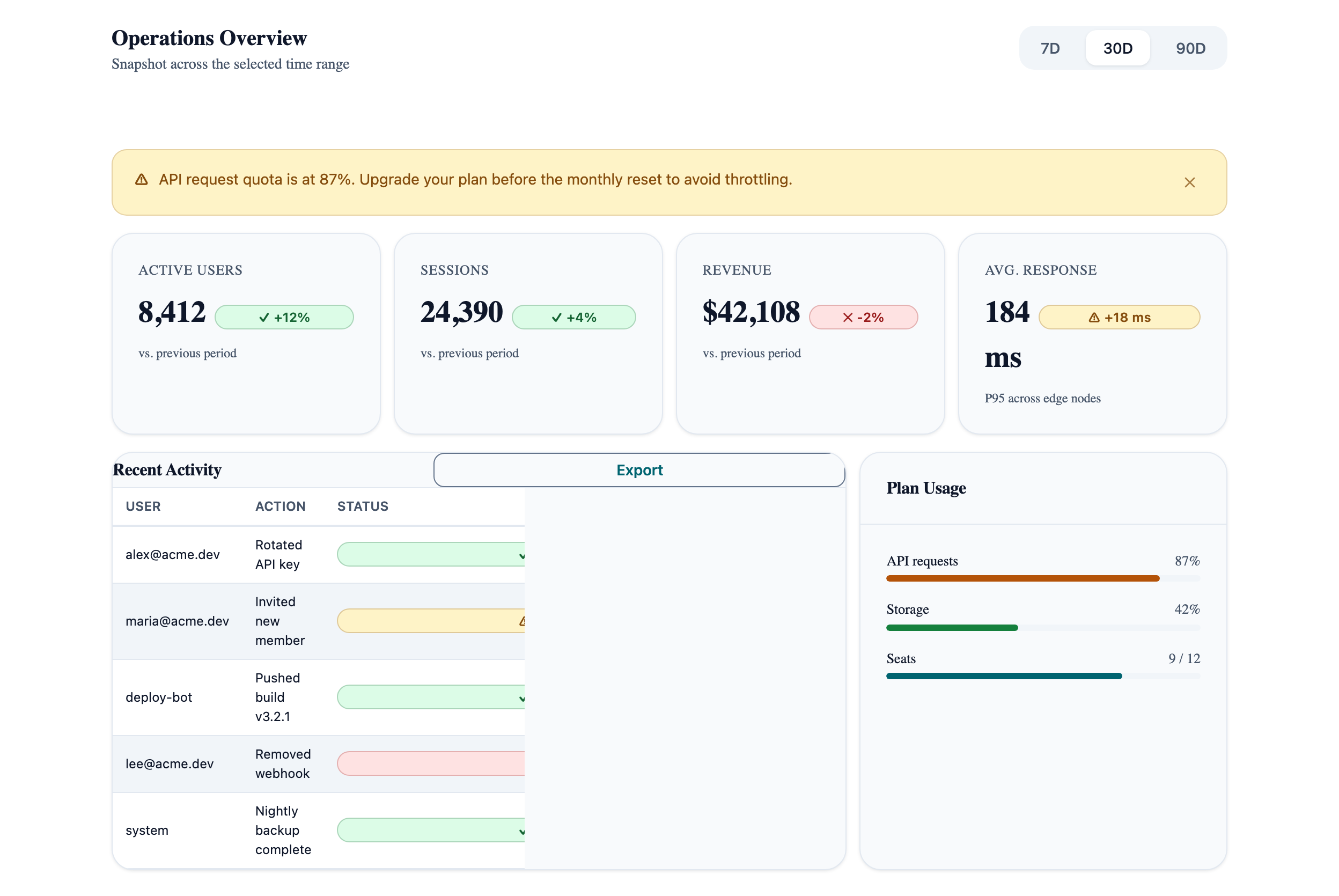
Management Dashboard
The densest cookbook pattern — metric cards, activity table, and quota indicators combined. Shows how Card, Table, TabGroup, Badge, Alert, and Progress fit together.
Operations Overview
Snapshot across the selected range
vs. previous period
vs. previous period
vs. previous period
P95 across edges
Recent Activity
| User | Action | Status | Time |
|---|---|---|---|
| alex@acme.dev | Rotated API key | Success | 2m ago |
| maria@acme.dev | Invited new member | Pending | 14m ago |
| deploy-bot | Pushed build v3.2.1 | Success | 1h ago |
| lee@acme.dev | Removed webhook | Failed | 2h ago |
Plan Usage
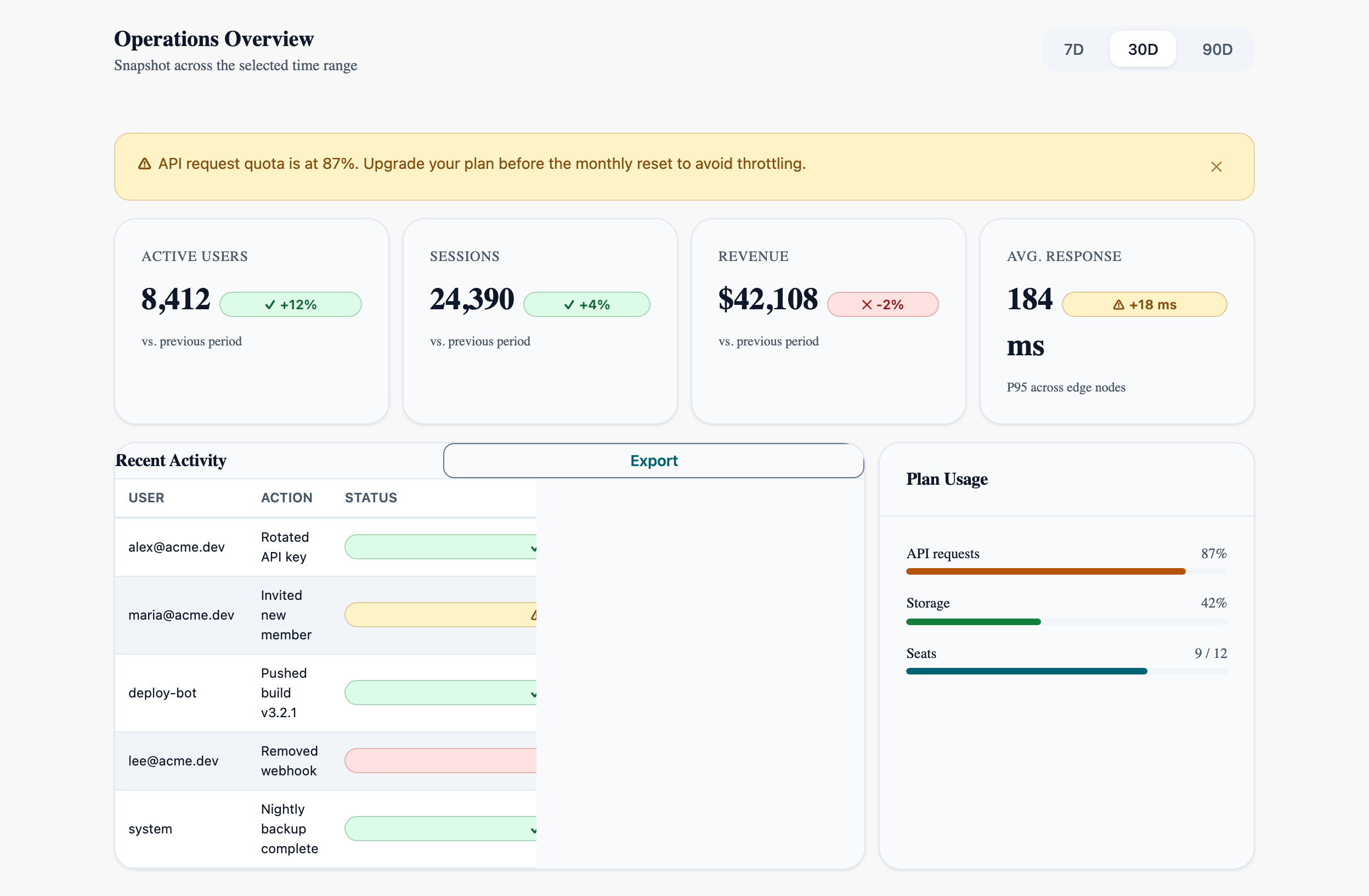
Visual reference
Storybook captures of this pattern in each framework, light and dark modes. The live demo above runs in React; these confirm the Angular and Vue compositions render the same way.
When to use
- Operational overview pages: metric cards above, table of recent activity below, supplementary indicators (quota, plan usage) on the side.
- Dashboards with a global time-range selector that re-scopes every widget — TabGroup with `variant="pills"` is the right control.
- When the user needs to triage at a glance and only drill in if a metric is anomalous (warning Alert above the threshold).
When not to use
- Single-metric pages — all this scaffolding is overkill for one number with a sparkline.
- Pages where the data is the whole point and side-by-side cards add no value — render the table full-bleed instead.
- Real-time dashboards with sub-second updates — these fight the static layout; use an SVG/canvas chart and drop the Card grids.
Accessibility
- LlmProgress for quota uses `role="progressbar"` with `aria-valuenow` — don't add a duplicate visible-text-only readout for screen readers; the role surfaces the value automatically.
- The metric card delta uses a Badge whose colour encodes direction. Pair every coloured delta with a `+` / `-` glyph so the meaning survives without colour.
- Recent-activity table's status column is colour-only when read alone — keep the textual label ("Success", "Pending", "Failed") inside the Badge.
See the accessibility overview for the site-wide WCAG stance and per-component focus / ARIA notes.
Common pitfalls
What an LLM most commonly produces wrong here.
- LLMs love to project tab content into a giant `ngSwitch` / ternary that re-renders the entire grid on each tab change. Bind only the data-fetch scope to the tab; let the layout stay static.
- Using `variant="warning"` Alerts for every quota above 50 % numbs the signal. Reserve for crossings of the actual SLA / billing threshold.
- Putting the table and the side panel into a single LlmCard collapses their independent scroll regions. They're siblings, not parent/child.
Variations
With drill-down per metric
Add an `onClick` that opens an LlmDrawer with the metric's history — Drawer keeps the dashboard context, Dialog would dim it.
Empty state
When no activity exists, replace the table with a centered LlmAlert + LlmButton ("Invite your first member") inside the same Card.
Code
Snippets are intentionally trimmed for readability. The full implementation — with state, styles, and demo data — lives in the framework Storybook files linked below.
<!-- Metric cards + activity table + quota widget. Uses Card, Table, TabGroup, Badge, Alert, Progress. --><llm-tab-group variant="pills" [(selectedIndex)]="range"> <llm-tab label="7D" /> <llm-tab label="30D" /> <llm-tab label="90D" /></llm-tab-group>@if (quota() >= 85) { <llm-alert variant="warning">API quota at {{ quota() }}%.</llm-alert>}<!-- ...metric cards grid (LlmCard + LlmBadge delta)... --><llm-table variant="striped" size="sm"> <llm-thead> <llm-tr><llm-th>User</llm-th><llm-th>Action</llm-th></llm-tr> </llm-thead> <llm-tbody> @for (row of activity(); track row.id) { <llm-tr> <llm-td>{{ row.user }}</llm-td> <llm-td>{{ row.action }}</llm-td> </llm-tr> } </llm-tbody></llm-table><llm-progress [value]="quota()" variant="warning" size="sm" /><LlmTabGroup variant="pills" selectedIndex={range} onSelectedIndexChange={setRange}> <LlmTab label="7D">{' '}</LlmTab> <LlmTab label="30D">{' '}</LlmTab> <LlmTab label="90D">{' '}</LlmTab></LlmTabGroup>{quota >= 85 && <LlmAlert variant="warning">API quota at {quota}%.</LlmAlert>}{/* ...metric cards grid (LlmCard + LlmBadge delta)... */}<LlmTable variant="striped" size="sm"> <LlmThead> <LlmTr><LlmTh>User</LlmTh><LlmTh>Action</LlmTh></LlmTr> </LlmThead> <LlmTbody> {activity.map(row => ( <LlmTr key={row.id}> <LlmTd>{row.user}</LlmTd> <LlmTd>{row.action}</LlmTd> </LlmTr> ))} </LlmTbody></LlmTable><LlmProgress value={quota} variant="warning" size="sm" /><LlmTabGroup variant="pills" v-model:selectedIndex="range"> <LlmTab label="7D"> </LlmTab> <LlmTab label="30D"> </LlmTab> <LlmTab label="90D"> </LlmTab></LlmTabGroup><LlmAlert v-if="quota >= 85" variant="warning">API quota at {{ quota }}%.</LlmAlert><!-- ...metric cards grid (LlmCard + LlmBadge delta)... --><LlmTable variant="striped" size="sm"> <LlmThead> <LlmTr><LlmTh>User</LlmTh><LlmTh>Action</LlmTh></LlmTr> </LlmThead> <LlmTbody> <LlmTr v-for="row in activity" :key="row.id"> <LlmTd>{{ row.user }}</LlmTd> <LlmTd>{{ row.action }}</LlmTd> </LlmTr> </LlmTbody></LlmTable><LlmProgress :value="quota" variant="warning" size="sm" />Open in Storybook
The same composition with state, styles, and demo data — running live in each framework Storybook.